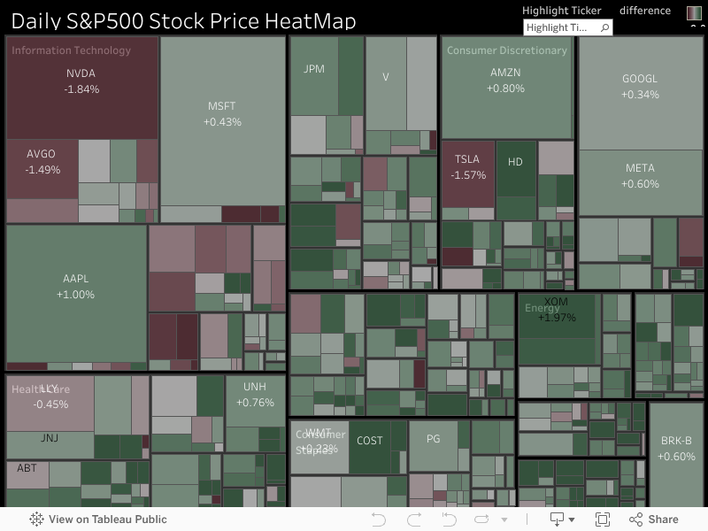
The S&P 500 stock heatmap
The Link to my tableau public about this heatmap.
Abstruct
The S&P 500 stock heatmap created using Tableau and powered by Python’s yfinance library. The heatmap offers a comprehensive visualization of the performance and correlations among the stocks comprising the S&P 500 index. This powerful tool allows investors, analysts, and financial professionals to gain valuable insights into the dynamics of the market and make informed decisions.
The codes that collect the data
#import yfinance to collect the data
import pandas as pd
import yfinance as yf
# refer to the wikipedia to get the lastest S&P500 stocks' list
sp500url = 'https://en.wikipedia.org/wiki/List_of_S%26P_500_companies'
data_table = pd.read_html(sp500url)
tickers = data_table[0]['Symbol'].tolist()
#As I am not in the US, refer to my timezone, I collected the data from the day before yesterday and yesterday to collect the close price and other stock information, for example, in my timezone:2024-05-10, and the US stock market hasn't opened yet. So I collected the time from 2024-05-08 to 2024-05-09, which I can do the difference and get the percentage rise or fall in stock. You can refer to your timezone to adjust these codes, or you can just remove them, and let the yfinance collect all-time prices of the SP500 stock.
from datetime import date, timedelta
yesterday = date.today() - timedelta(days=2)
start_day = yesterday.strftime('%Y-%m-%d')
today = date.today()
end_day = today.strftime('%Y-%m-%d')
#As some of the yahoo finance(yfinance)'s stock name don't match the wikipedia's stock names:, we need to rename them.
for i in range(len(tickers)):
    if tickers[i] == 'BF.B':
        tickers[i] = 'BF-B'
    elif tickers[i] == 'BRK.B':
        tickers[i] = 'BRK-B'
import warnings
warnings.filterwarnings('ignore')
#get the price data of SP500 from yfinance
df = pd.DataFrame()
for ticker in tickers:
    prices = yf.download(tickers=ticker, start=start_day, end=end_day)
    prices['Ticker'] = ticker
    df = df.append(prices)
df.reset_index(inplace=True)
df = df[['Ticker', 'Date', 'Open', 'High', 'Low', 'Close', 'Adj Close', 'Volume']]
# get the market cap
df2 = pd.DataFrame(columns=['Ticker', 'Market Cap'])
for ticker in tickers:
    ticker_obj = yf.Ticker(ticker)
    market_cap = ticker_obj.info.get('marketCap', 'N/A')
    df2 = df2.append({'Ticker': ticker, 'Market Cap': market_cap}, ignore_index=True)
merged_table = pd.merge(df, df2, on='Ticker', how='left')
# the final merged document that collects all the information we need: Ticker, Date, Open, High, Low, Close, Adj Close, Volume, Market Cap, Security, GICS Sector, GICS, Sub-Industry, Headquarters, Location, Date, added, CIK, Founded
df3 = data_table[0].rename(columns={'Symbol': 'Ticker'})
merged_table_final = pd.merge(merged_table, df3, on='Ticker', how='left')
merged_table_final.to_csv('SP500_heatmap_industry.csv', index=False)
Then we can use this SP500_heatmap_industry.csv to do the daily heatmap.
Visualization using the tableau
This S&P 500 stock heatmap, inspired by a YouTuber(Dorian Banutoiu - Canonicalized), is created using Tableau. By following the techniques demonstrated by the YouTuber, I recreated the heatmap to provide a visual representation of the performance and correlations among the stocks comprising the S&P 500 index.
About the project
This is all of my project, If you encounter any issues or have questions, please feel free to contact me via email on my home page! Thank you for considering contributing to this project! I appreciate your interest and help in making this project better.